Café Bustelo
The main goal was to find a boxed product and re-brand and design existing packaging for a boxed product using only typography.
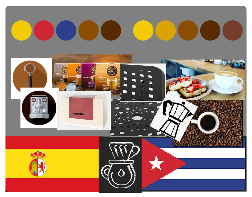
Audience
My target audience for this project was adult coffee drinkers who relish bold and rich espresso-style coffee, whether as a daily indulgence or an occasional treat.
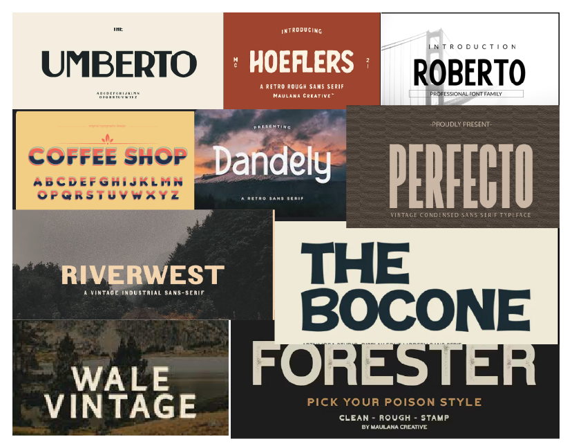
For this redesign, I retained the bold font that evokes the strong espresso-style coffee our audience loves. However, I also wanted to pay homage to the heritage of our Latin coffee, its places of origin, and the rich history it carries. My goal with this redesign was to update the current product with a visually appealing design that would evoke a sense of pride and connection to our coffee's origins and history. This unique blend of boldness and heritage is what sets our product apart and makes it a compelling choice for our target audience.
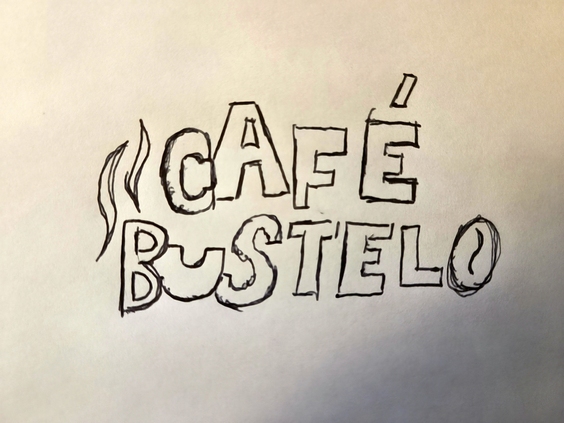
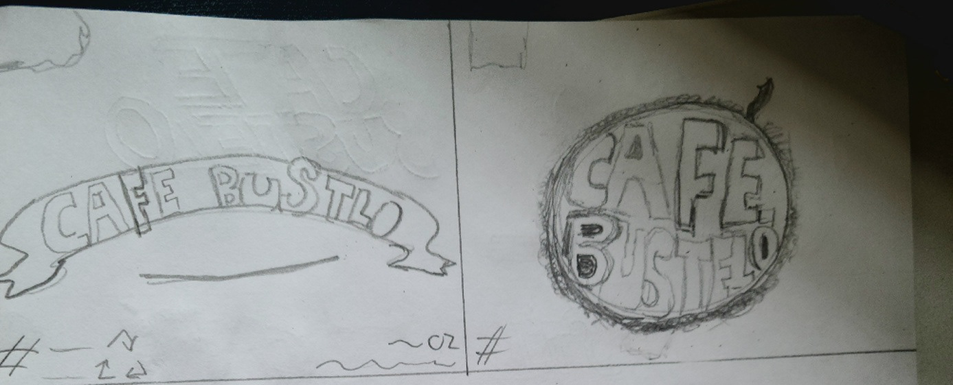
Sketches
To make the brand more unique, I embarked on an extensive research process. I sought inspiration from various shops in the Caribbean, using Google Maps to explore the streets of different Caribbean islands. This allowed me to gather ideas for incorporating local business elements and styles into my sketches, ensuring that our redesigned product would resonate with our target audience.

Digital Draft
I meticulously analyzed feedback from designers and external sources, using it as a guiding light in the design process. This feedback was instrumental in creating a digital draft that incorporated a recipe, Taíno symbols, and a brief history. These additions were not arbitrary but were influenced by the feedback, ensuring that our redesigned product would meet the needs and preferences of our target audience.
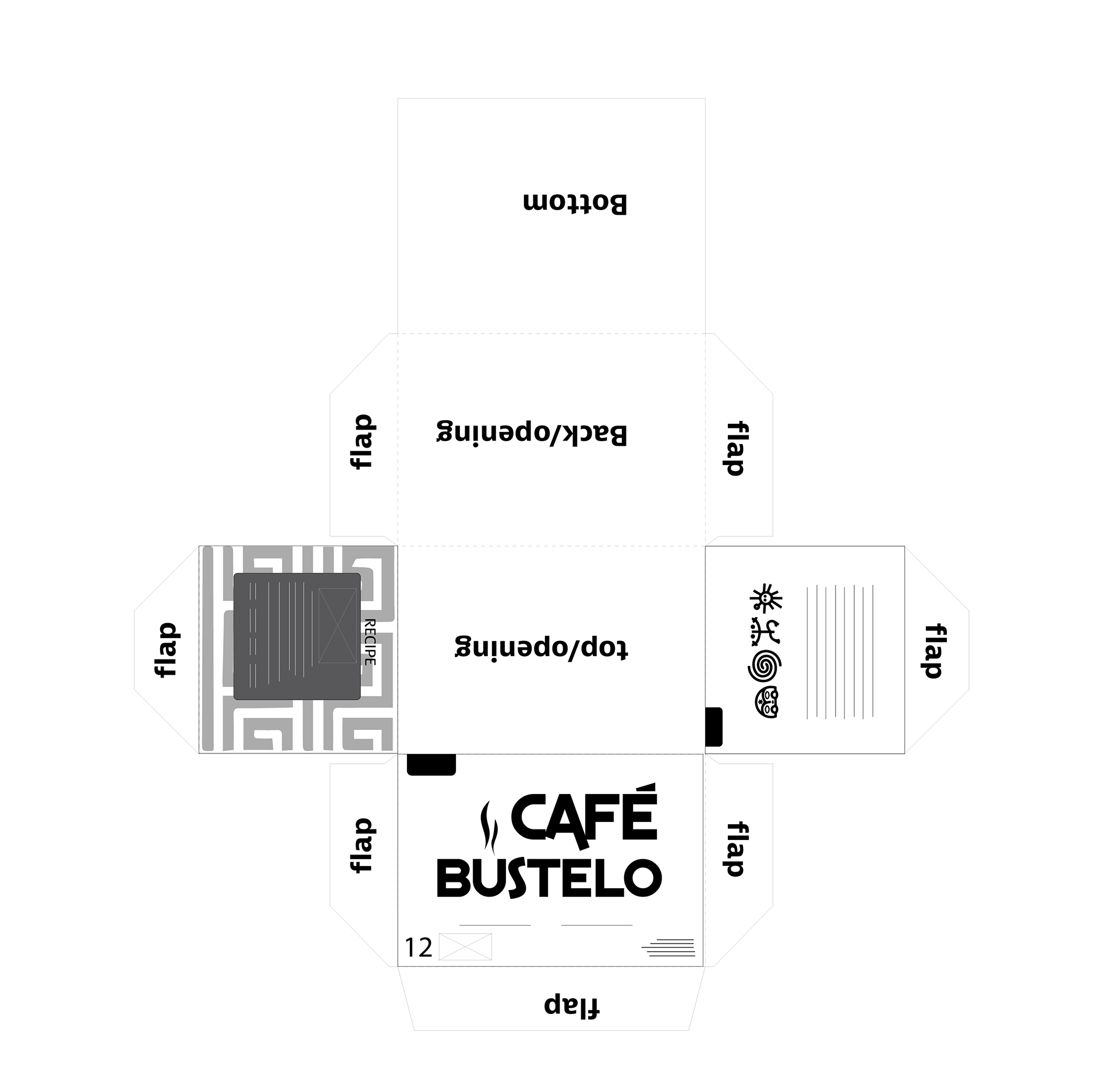
I created a die-line to understand the product layout better and added extra elements like a recipe and historical blurb. Taíno symbols were used for heritage elements. The pattern design was integrated with the original colors to stand out from competitors.

Digital Round 1-v1
Digital Round 1-v2
Digital Round 2

Digital Round 3
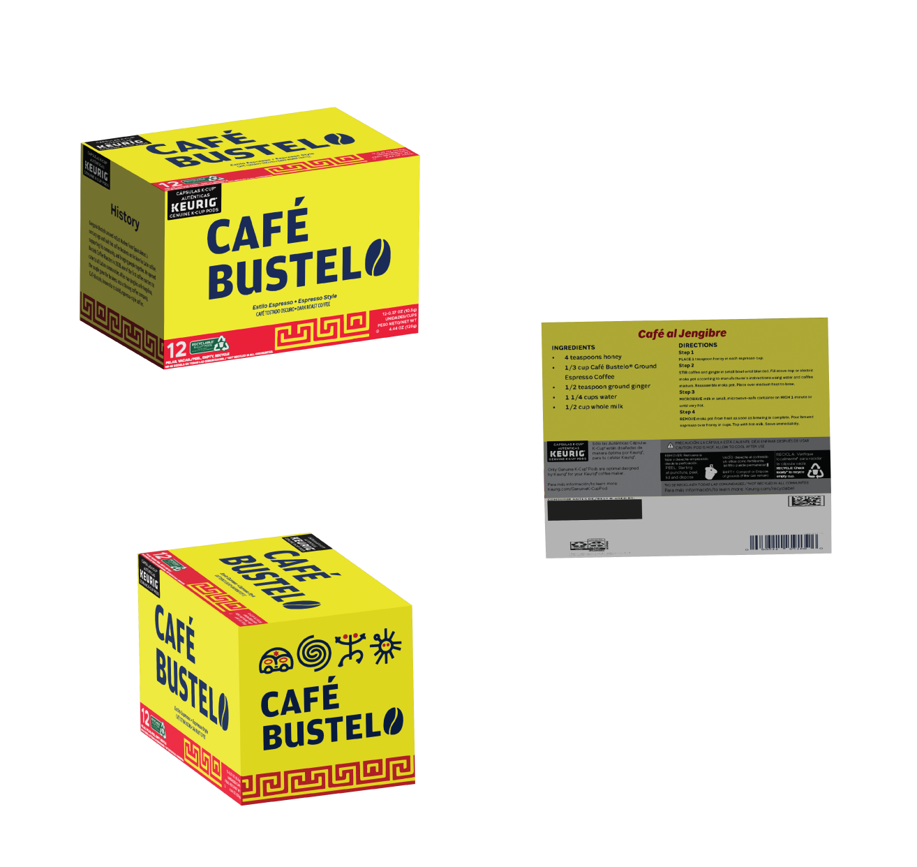
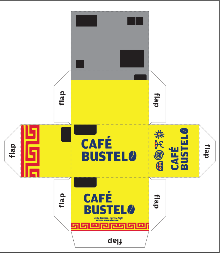
Final Draft
The 3D mockup's final design is a testament to our commitment to excellence. It features the logo with the coffee bean, a bold and unmistakable symbol of our product's rich taste. The pattern, integrated into the color band around the lower half of the product's box, is a visual representation of our coffee's unique heritage. The recipe, relocated to the back of the box, is now more accessible. The Taíno symbols, added to the side of the box alongside the company logo, are a proud declaration of our coffee's origins. While there is always room for improvement, we are confident that this design will be a resounding success, captivating coffee lovers worldwide.